
FOUNDERS BREWING CO.
MORTAL BLOOM
Identity, Packaging, Campaign
THE SITUATION
Founders Brewing Co., a beloved craft brewery with a deep portfolio, had long catered to seasoned craft beer enthusiasts. But as Gen Z consumers began coming of age, it became clear their tastes – and values – diverged dramatically from previous generations. They seek brands with meaning, aesthetic appeal, and a sense of play. To meet this shift, Founders needed to break new ground with a brand crated specifically for Gen Z sensibilities.
THE SOLUTION
We developed the “Keep Life Colorful” brand platform – rooted in the shared belief between the brand and its new audience that life should be lived in big, bold, beautiful color. From this insight, Mortal Bloom was born: a name and creative strategy that juxtaposes the very human (mortal) existence with the stunning vibrancy of a life lived in full bloom – a vibrancy that drives the brand to seek out all the fascinating, funny, fresh, wild, absurd and thought-provoking things that help make every day bigger and better.
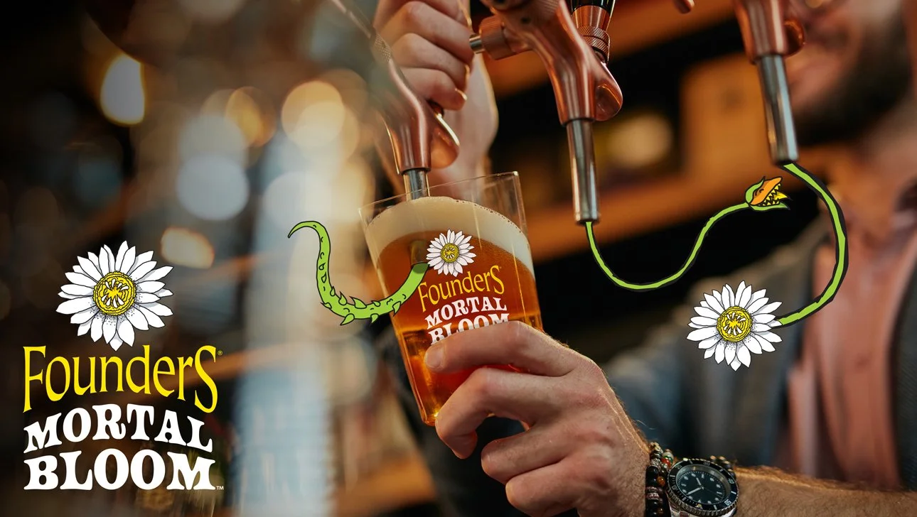
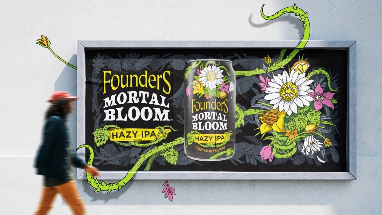
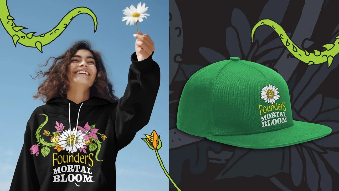
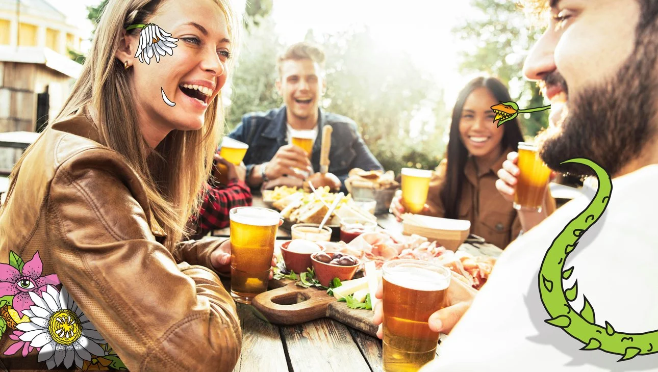
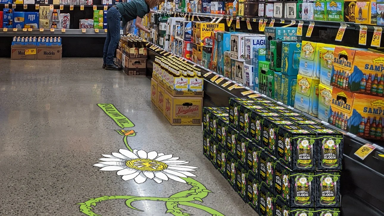
THE EXECUTION
The identity system, package design and campaign bring that striking juxtaposition to life with an arresting visual twist: at first glance, a bright, colorful bouquet of flowers; on closer inspection, unexpected, surreal, and slightly offbeat elements emerge. It’s bright and joyful – but with an edge. The system brings all-important pop and personality to every touchpoint, easily flexing and extending across packaging, digital and merch in creative and surprising ways.

THE RESULTS
Within months of launch, Mortal Bloom was the #2 new craft item nationally – and the #1 new hazy IPA. It also shifted Founders’ traditionally 15-pack-heavy lineup into more profitable, sample-friendly 6-packs, which quickly accounted for nearly 50% of sales.
IMAGES © TRINITY BRAND GROUP