GYMBOREE INC.
GYMBOREE
IDENTITY, PACKAGING, LAUNCH MATERIALS, TYPE DESIGN

THE SITUATION
Gymboree had recently brought on a new CMO direct from Urban Outfitters whose vision was to take Gymboree beyond its cutesy, matchy-matchy kids’ clothes to something more modern and exciting.

THE SOLUTION
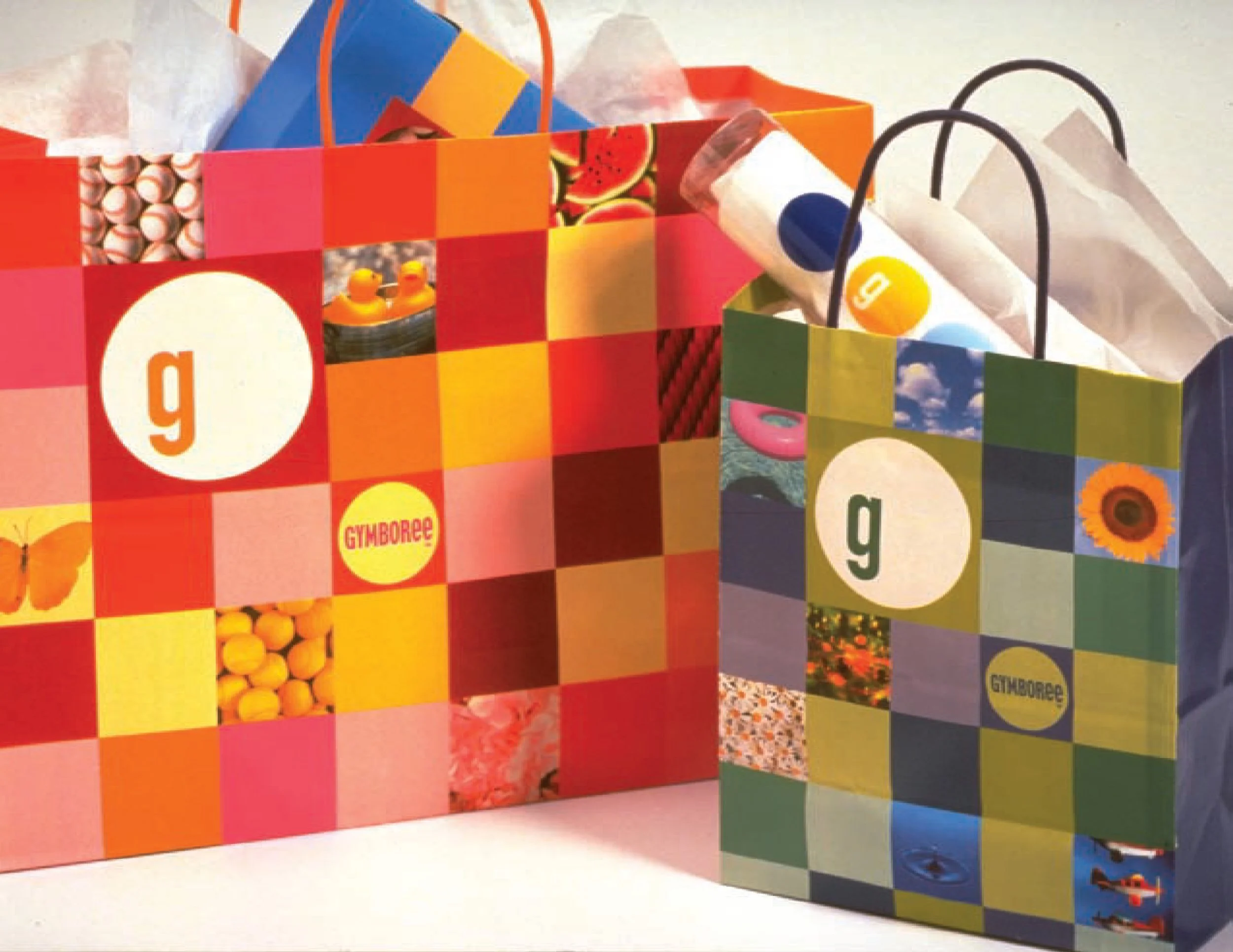
We developed a new identity system far beyond the typical mass market design system. This had a modular approach with built in flexibility to change and flex with the season, the department, or the application. While we maintained consistent elements across the system – the wordmark, the circle G, the grids of circles and squares – color palette, photography, and texture were dictated by the product.

THE EXECUTION
For the launch, we created a robust system of shopping bags, hang tags, woven labels, and signage. We designed a custom typeface that balanced the fun of childhood with the new, more sophisticated clothing styles by employing a unicase – a mix of upper and lowercase letterforms all at the same height.


THE RESULTS
While the new apparel style was not a hit with consumers, the company maintained the new dynamic design system as it moved forward with the original clothing styles that consumers loved.