SAVANNAH DISTILLING CO.
SAVANNAH IDENTITY AND BLUE RUDDER
IDENTITY, PACKAGING

THE SITUATION
With the formal launch of Savannah Distilling – evolving from its roots as Savannah Bourbon Co. – the company set its sights beyond spirits, aiming to expand into new beverage categories. We were brought in to craft a brand strategy and identity system for the newly repositioned company, as well as to design the identity and packaging for its first innovation: a craft cocktail brand that could carry the ethos of Savannah into a lighter, more social drinking occasion.

THE SOLUTION
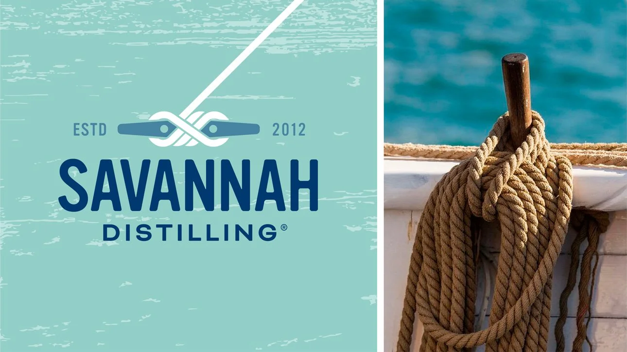
The new Savannah Distilling identity captures the spirit of the Lowcountry. At the heart of the system is a distinctive “Lowcountry blue,” a shade pulled directly from Savannah’s landscape and culture, seen in its waterways and even on the ceilings of historic screened porches. It evokes a life lived on and by the water. The brandmark, a dock cleat, ties it all together – symbolizing both the excitement of the start of the day’s good times on the water and the happy satisfaction of a day well spent.
THE EXECUTION
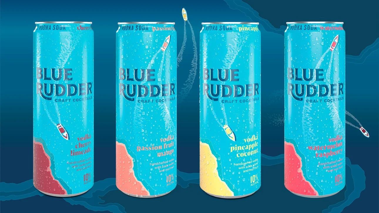
For Blue Rudder, Savannah Distilling’s first craft cocktail brand, we extended that Lowcountry spirit into a more casual, day-drinking occasion. The design centers around an iconic center-console fishing boat cutting through coastal waterways, its wake trailing behind – a visual metaphor for the freedom, topography, and laid-back adventurous lifestyle that the Savannah Distilling brand represents.

THE RESULTS
The launch of the Savannah Distilling identity and Blue Rudder marked a turning point – helping the company shed its bourbon-only image and reframe itself as a modern beverage brand. The expansion into outdoor, daytime, and social occasions created new opportunities for growth and laid the groundwork for further innovation.


IMAGES © TRINITY BRAND GROUP